d:picto

How the pictograms are made

Every pictogram is constructed, not drawn – and tested with the public.

Constructed, not drawn

All pictograms are based on a grid of 72 × 72 units. Anchor and control points always lie on grid points.

This system allows an almost endless variety of shapes while ensuring that the pictograms form a visually consistent family.

The teacup on the 72 × 72 grid: anchor and control points lie on grid points.

The semiotic tetrahedron

The semiotic triangle explains why and how a pictogram is read and understood correctly.
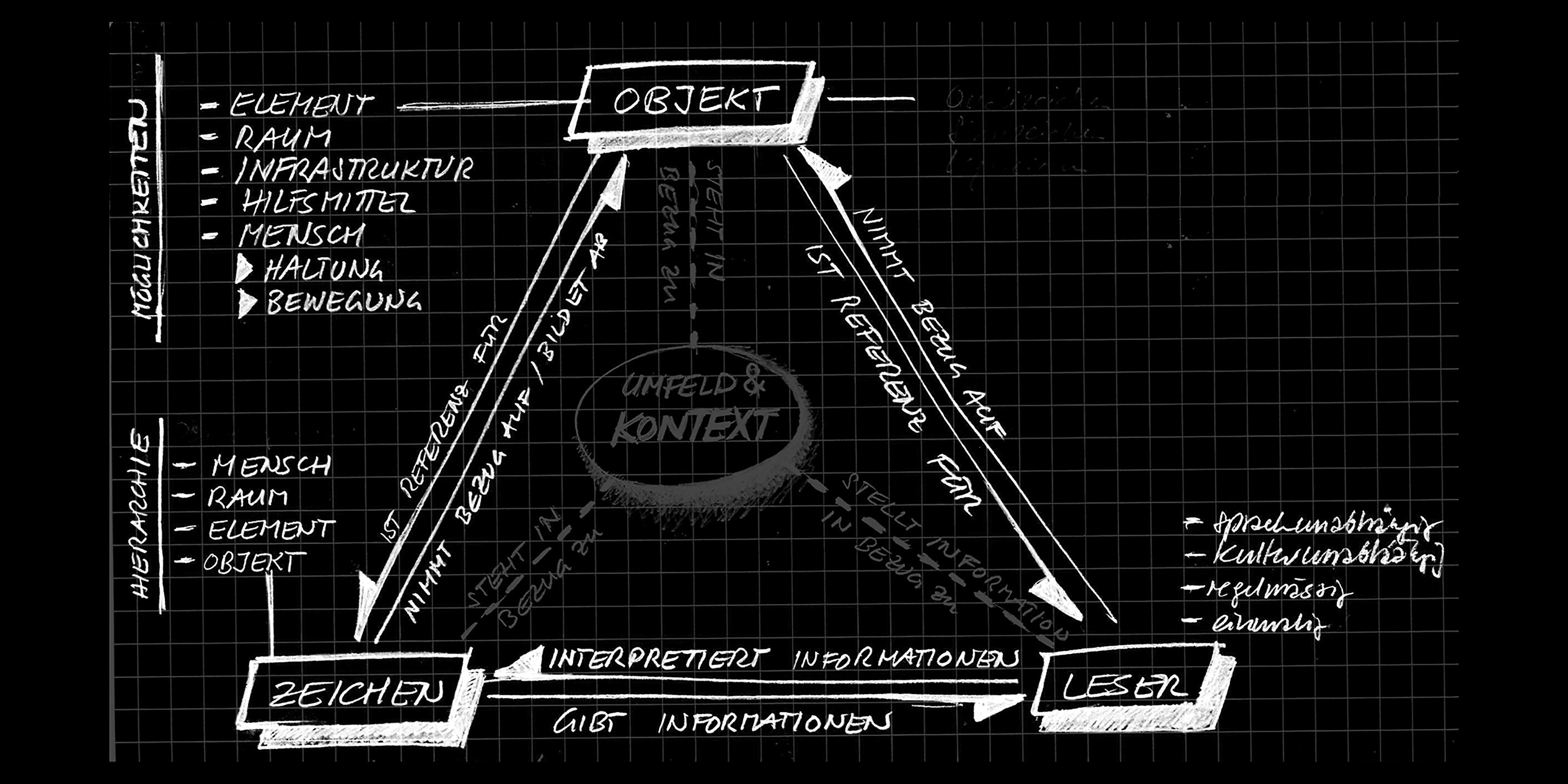
Hand-drawn sketch of the semiotic triangle, with environment and context added as a fourth point
In his master’s thesis, Rolf Widmer identified an important aspect missing from the semiotic triangle that explains how a pictogram works: its surroundings and spatial setting, and therefore its context. He developed the idea of the semiotic tetrahedron to incorporate this into the model.
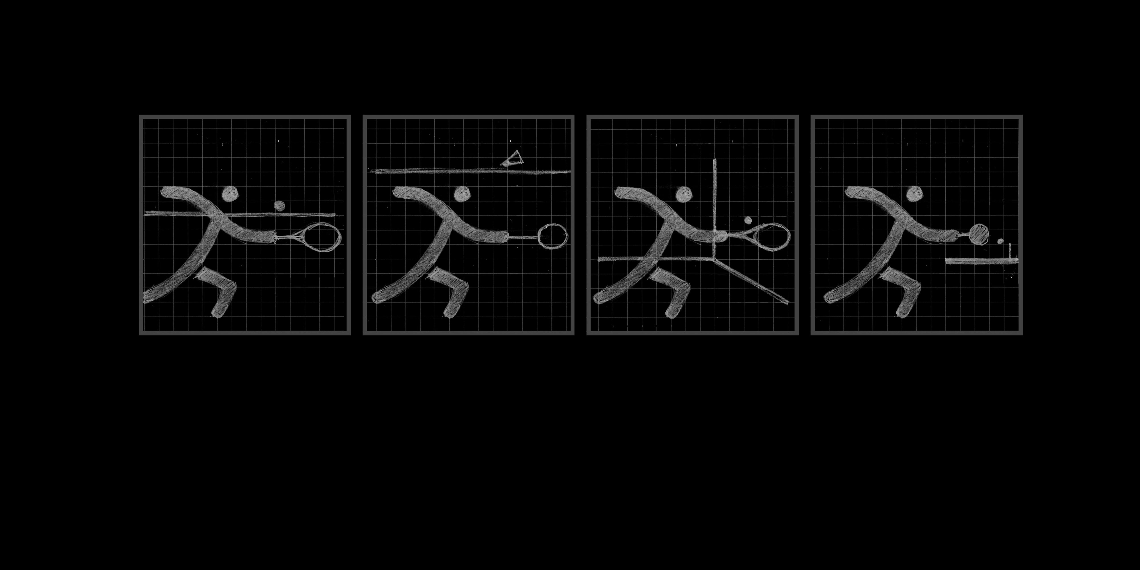
Four pictograms showing the same figure: depending on the line, they represent tennis, badminton, squash or table tennis
This series shows how the depiction of space helps determine how a pictogram is interpreted and understood. The figure stays the same, but changing the position or shape of a single line turns tennis into badminton, squash or table tennis.

A systematic approach to pictogram design

Rolf Widmer developed a model to give pictogram design a systematic basis. It describes the content and interactions clearly, helping to create pictograms that are likely to be understood correctly at first sight.
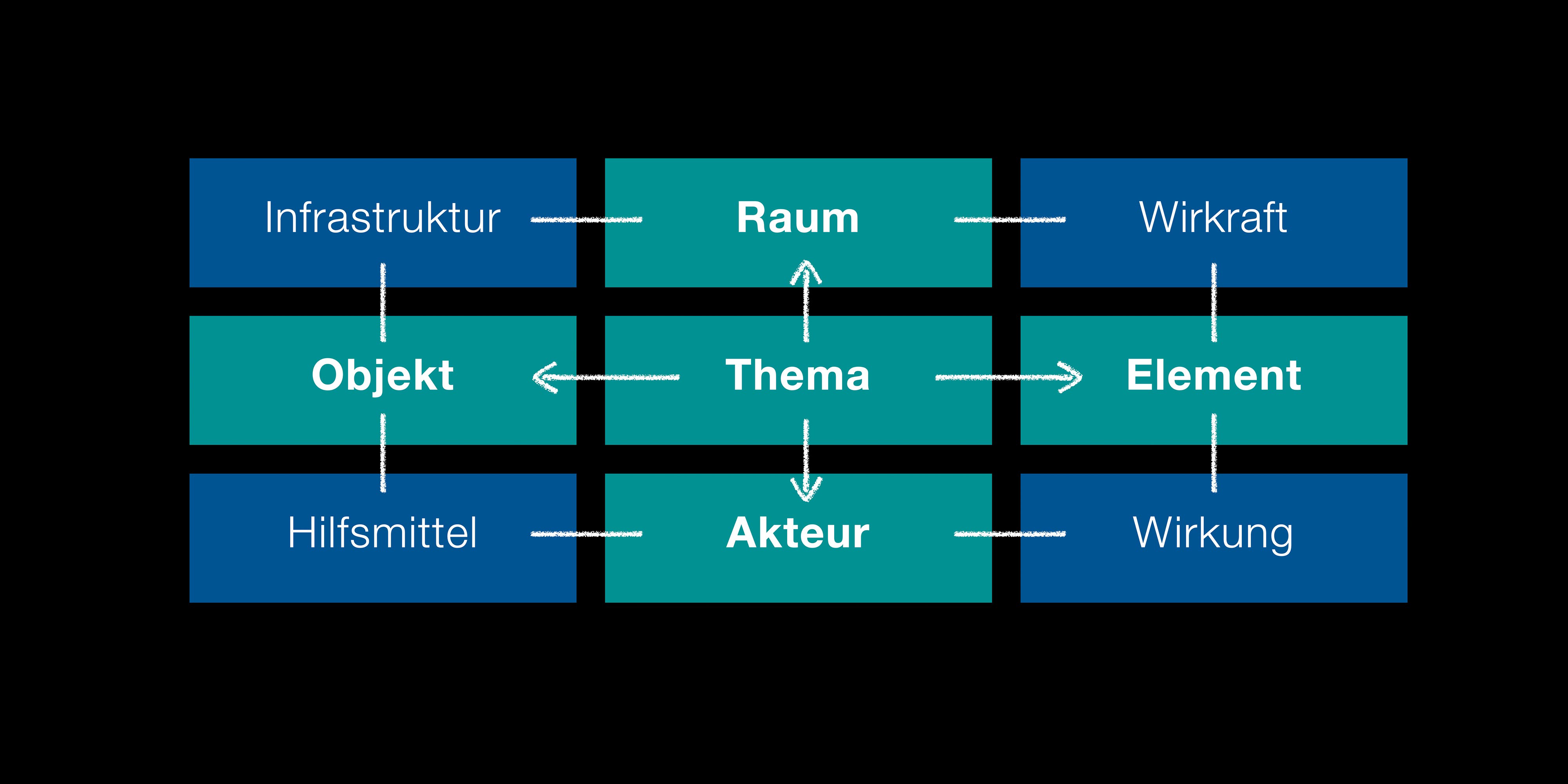
Diagram of nine fields: infrastructure, space, force, object, theme, element, aid, actor, effect
Based on the semiotic tetrahedron, Rolf Widmer developed a diagram that can accurately describe a pictogram and its content.

Tested for clarity

At the sketch stage, up to 15 variants of each pictogram are tested with up to 100 people.
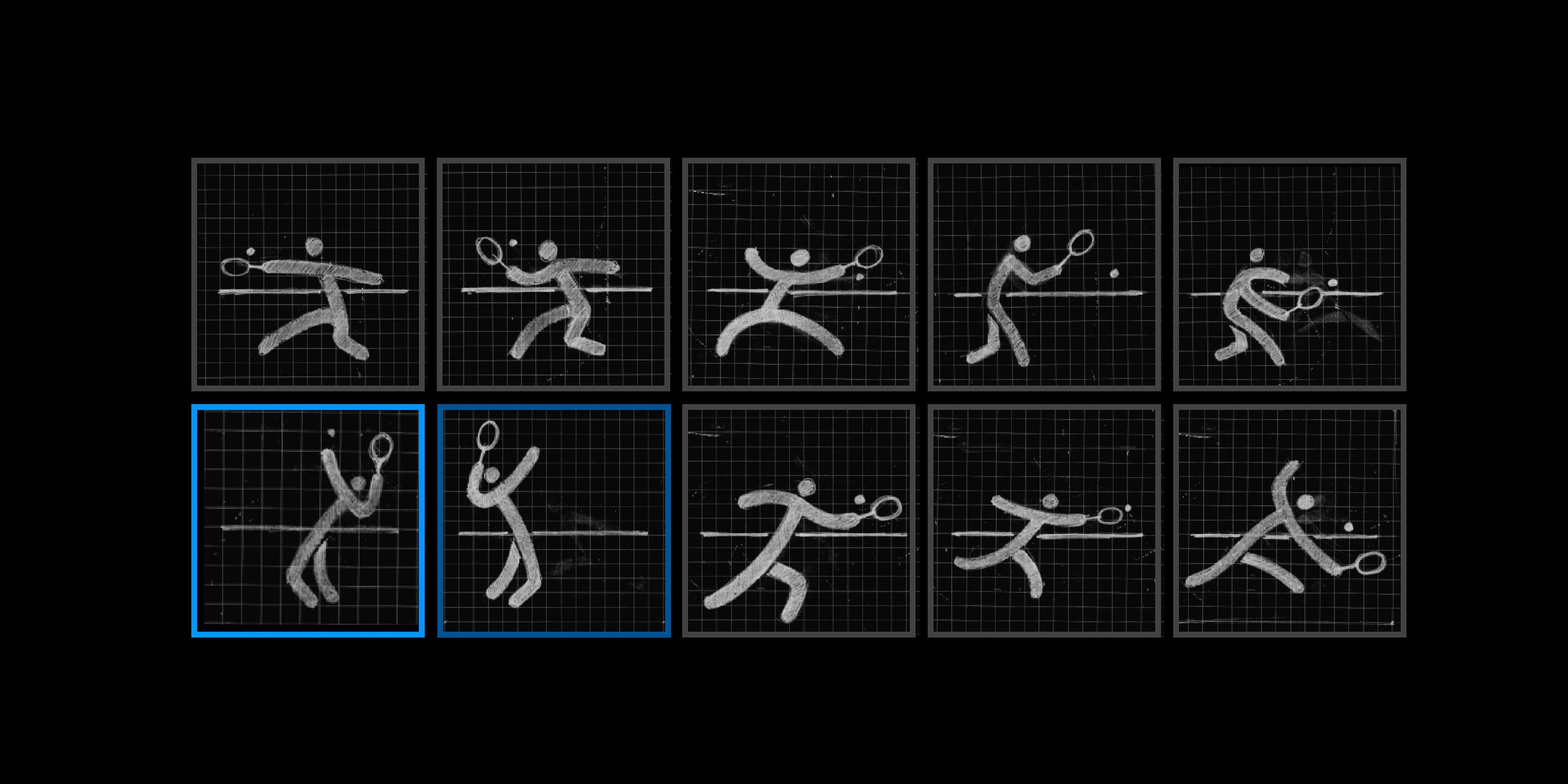
Nine sketch variants of the same tennis pictogram, two of them highlighted
We test the pictograms with many people to ensure that they are understood. We develop the sign with the highest recognition rate into the final pictogram.

Develop your own – or “Pro”

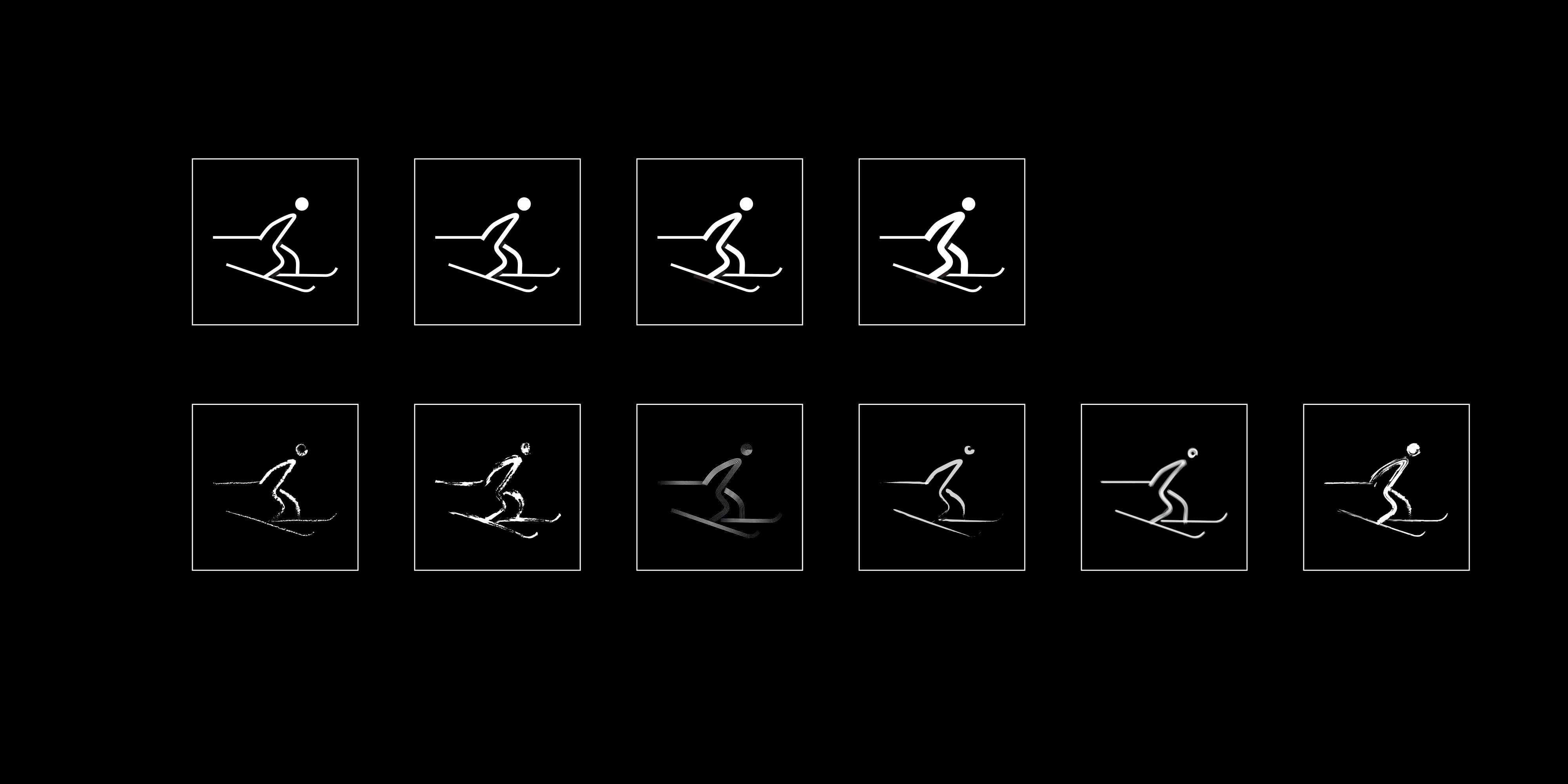
Developing pictograms of this complexity and quality takes time. With the “Pro” version, you can customise the stroke weight and style to suit your project and your clients.
Vector or Pro – the difference

The same cross-country skiing pictogram in four stroke weights and six stroke-style variants
One pictogram, ten versions: four stroke weights at the top, six stroke-style variants at the bottom.

If you cannot find the pictogram you need, please let us know. We will create it promptly and add it to the online catalogue.